


This is a book designed by Neil Donnelly, a recent graduate student in Yale's graphic design program. The book documents the thesis presentations of a group of graduate design degree candidates. Each photograph in the book is sized according the the length of time it was visible in an individual's presentation. 1 second = .5 square inches. The resulting foredge of the book is subtly striking and thought provoking.
Canada Type


I've been doing some research on type for an upcoming wedding invitation I'm designing and printing letterpress, and came across the stunning digital typography of Canada Type. They often revive mid twentieth century faces, which is perfect for my client's taste. What I love about many of their faces is how many alternates they create. Where a typical digital font might contain 250 or so glyphs, some typefaces from Canada Type include 650 glyphs. Each capital might have 3 or 4 variations. The effect is killer--a single word could have many different iterations, simply by swapping out a letter for one of its alternate forms. As much as we all love metal type, the flexibility of digital type and printing with photopolymer or metal plates give a letterpress printer so many options.
See the above font called Memoriam. With those thin hairlines, I think this could look great printed with the letterpress and I can't wait to try it.
Jennie Nayton


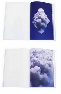
Cut paper photographs, books and installations by Australian artist Jennie Nayton. You can see more of her work on her Flickr photostream. Her artist's book pictured here Smoke Unfolding is in the collection of the State Library of Queensland which has the largest publicly accessible collection of artist's books in Australia. Photos published with permission from the artist.
Wood Veneer Books


Custom books by Shelter Bookworks. Sewn boards binding with birch veneer covers. Terrarium and cinderblock not included.