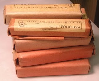

This is brand new metal type still in its package from the Bauer Type Foundry. The Bauer Type Foundry operated from 1837 to 1972 in Frankfurt, Germany. That puts the age of these unopened font sets at approximately 35 years. I've recently purchased several brand new (old) packages of foundry type for use in my Kensol stamping press. You can see the chase I use here for the Kensol and how I set the type. Using metal type (whether it is brass or foundry type) to stamp on bookcloth, paper or leather, is incredibly satisfying. That is why these neat little faded red packages all stacked together give me a slight rush. I am strange--I know this.
Artist's Book spread in Artforum

Over the past couple of years, I have noticed Artforum's willingness to publish reviews of book-related artwork. This makes me very hopeful about the position of artist's books today in the overall contemporary art scene.
In the October 2008 issue of Artforum, there is a substantial spread on the artist's book Sabotage by Charline von Heyl. The full text of the article with images is at the Artforum website. Here is the link: http://artforum.com/inprint/issue=200808&id=21139
The Story of My Printing Press

Winter of Artifice
Originally uploaded by Photo2217
Photo used by permission of Liz Cantu
Anais Nin wrote "The Story of My Printing Press" to describe the process of printing her own work on a foot-pedal operated platen printing press in the late 1930s and early 1940s. The resulting book, Nin's Winter of Artifice, was printed in an edition of 300 copies. "The Story of My Printing Press" is a fascinating examination of why an author might choose to print her own work and what it means when that limited edition book goes out into the world. Here's an excerpt:
"It was hard work. Patient work, to typeset prose, to lock the tray, to carry the heavy lead tray to the machine, to run the machine itself, which had to be inked by hand. Setting the copper plates (for the illustrations) on inch-thick wood supports in order to print them. Printing copper plates meant inking each plate separately, cleaning it after one printing, and starting the process over again. It took me months to typeset Under a Glass Bell and Winter of Artifice. Then there were the printed pages to be placed between blotters and later cut, put together for the binder and gathered into signatures. Then the type had to be redistributed in the boxes."
We Do Design


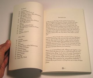
I was just sent copies of the latest book I designed for Slope Editions, Bow, by the late poet Penelope Austin. I was honored to work on the project. I designed the cover and typeset the interior using LTC Cloister Pro.